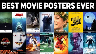
Title: Designing Cinematic Elegance: A Guide to Creating Stunning Film Art and Posters
Introduction:
The visual allure of a film begins long before the opening credits roll – it starts with the creation of captivating film art and posters. These promotional materials serve as a visual gateway, offering audiences a glimpse into the mood, tone, and essence of the cinematic experience. In this blog post, we’ll explore the artistry behind designing stunning film art and posters, providing 3d movie maker and designers with insights to craft visuals that leave a lasting impression.
Understand the Essence of Your Film:
- Before delving into design, immerse yourself in the essence of your film. Identify its core themes, emotional undercurrents, and unique visual elements. This deep understanding forms the foundation for creating art that resonates authentically with the film.
Define Key Visual Elements:
- Pinpoint the key visual elements that encapsulate the spirit of your film. Whether it’s a striking image, a symbolic motif, or a distinctive color palette, these elements will serve as the visual anchors of your design. They should evoke curiosity and reflect the film’s identity.
Establish a Consistent Visual Language:
- Consistency in visual language is crucial. Ensure that the design aligns with the film’s genre, tone, and overall aesthetic. A cohesive visual language across promotional materials fosters recognition and reinforces the film’s branding.
Choose an Eye-Catching Image:
- Select a compelling and eye-catching image that encapsulates the essence of your film. This image will be the focal point of your poster, drawing viewers in and inviting them to delve into the narrative. High-quality, professionally shot images are essential for creating a visually stunning poster.
Consider Composition and Layout:
- Thoughtful composition and layout are integral to a visually pleasing poster. Balance is key – arrange visual elements in a way that guides the viewer’s gaze and maintains a harmonious overall design. Experiment with different layouts to find the most impactful arrangement.
Typography Matters:
- Choose typography that complements the overall design and enhances readability. The font style, size, and color should align with the film’s aesthetic. Ensure that important text, such as the film title and tagline, is prominently featured and easy to read.
Embrace Negative Space:
- Negative space can be a powerful design element. Embrace whitespace to create a clean, sophisticated look. Negative space not only enhances readability but also allows key visuals to stand out more prominently.
Play with Color Palettes:
- Colors evoke emotions and set the tone. Experiment with color palettes that convey the mood of your film. Whether it’s vibrant and energetic hues for a comedy or muted tones for a drama, choose colors that resonate with the film’s narrative.
Explore Iconography:
- Incorporate symbolic or iconic elements that represent key themes or motifs from the film. These can serve as visual cues that intrigue the audience and offer subtle hints about the story.
Tell a Visual Story:
- Let your poster tell a visual story. Craft a narrative through the arrangement of images and the interplay of visual elements. A well-designed poster should not only grab attention but also offer a glimpse into the narrative world of the film.
Create Variations for Different Platforms:
- Tailor your design for various platforms and sizes. Consider how the poster will appear in different contexts – from cinema displays to online platforms and social media. Adjust the layout and composition accordingly for optimal visual impact.
Seek Feedback:
- Before finalizing your design, seek feedback from peers, colleagues, or target audience members. External perspectives can offer valuable insights and ensure that your design resonates effectively.
Collaborate with Professional Designers:
- If possible, collaborate with professional graphic designers who specialize in film marketing. Their expertise can elevate your vision and bring a polished, industry-standard quality to your film art and posters.
Utilize Motion Graphics for Teasers:
- In the digital age, consider incorporating motion graphics for teaser materials. Animated posters or dynamic visual elements in teaser videos can enhance engagement and generate buzz leading up to the film’s release.
Include Key Information:
- Ensure that essential information, such as release date, cast, and credits, is included in a clear and concise manner. This information is vital for both marketing and providing context to potential viewers.
Conclusion:
Designing stunning film art and posters is an art form that transcends mere promotional material – it is an invitation to immerse audiences in the visual tapestry of a cinematic journey. By marrying creativity, understanding the film’s essence, and embracing design principles, filmmakers can create promotional visuals that not only captivate the eye but also serve as a compelling introduction to the cinematic world they’ve crafted. As these visuals grace screens and display boards, they become a beacon, drawing audiences into the spellbinding realm of storytelling and anticipation.


